On the contrary, there are ideas that have yet to be realized, and topics that have barely been touched. I've lost considerable steam here, yes. This can possibly be attributed to several things: One, I've been reading a ton-load of books. Two, I am trying to acquire pictures of things that I both promised to blog about and I very much want to post on. Three, my obsessive nature leads me to do one thing very intensively, and then forget about it for a time while I obsess about something else. Four, I realized that I actually have other things I've been neglecting to do, mostly stuff around the house. I mean, not just
some things, more like a list of about 30 things I've been neglecting. Lucky for you, I've got some useless banter to fill the void today, including a trip we made to Ikea yesterday. We brought home some beautiful white furniture for our bedroom that looks something like this:
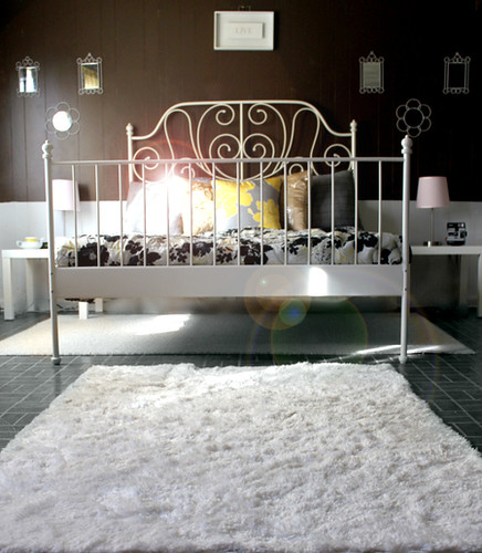
I really love this style of bed frame. It's simple and classic; I doubt that this is going to look tacky and outdated ten years from now. It almost looks vintage, and I liked vintage before it was cool to like vintage (Uh oh, I sound like a hipster!) I found this image on a google image search and would attribute the source if it was known to me:
Isn't it gorgeous? I love it. Unfortunately, I married a man who loves sleek and modern decor (which utterly clashes with my love of classic) so we had quite a time trying to compromise on decorating the house. We both liked the Ikea Hemnes series. It looked simple and vaguely "country" style to me, but sleek enough to satisfy Jorge's tastes. Either that or I'm just rubbing off on him. Anyway, our dressers look like this:
So, white bedroom furniture. I like the look of wood furniture, but the floors of our bedroom are some kind of wood laminate that looks somewhat like this:
I thought that the wood finishes we liked best would clash with this color floor, so we went with white. It's not only a pretty color, but it's safe and it matches with things. Now we are asking ourselves what we are going to do about the paint job. The previous owners didn't do a very good job, but they left the can of paint at the house. I like the color, but am not sure that it would work with everything else we've got going on. I mean, it looks good (and would look better as a contrast against the white) but I spent years of my life making this quilt and want it to look really nice with the quilt as the focal point of the room, without compromising the beautiful contrast of the headboard against the wall. Our walls are currently this color:

It feels a little darker than it looks in the picture. I know that it would contrast against the headboard on the bed, and made that stand out... but I feel like maybe going a little lighter or maybe in the neutral range. Here's what
the quilt I'm talking about looks like:
So, what do you think? Leave it like that? Maybe go a little lighter and match the green on the quilt? Go neutral? Darker? Blue? Purple? All I know is from reading blogs like
Design*Sponge. I don't claim to be good at this, but I'm pretty sure I know what I like (more or less). Now that I'm shifting gears back into house decorating, I think I'm going to follow up with the things we have already did back in April and May.


I didn't realize at the time that the brown wall image was to show an example of contrast. I was actually going to suggest we try with darker colors too. Except instead of pure dark, something "dusty". I stuck your image of the quilt in Kuler and it pulled up these shades. It also liked a pink color it found in the flowers, but I didn't think we'd be up for that. The purpose is what I had in mind.
ReplyDeletehttp://kuler.adobe.com/#themeID/1526586